Thanks to the power of the Internet, we’ve entered into an era where even the smallest of businesses can operate on a global scale if they so choose. If you’re in e-commerce, for example, it’s easy to imagine a situation where you could have customers (and orders) coming in from literally any country – which means that if you don’t want to potentially leave a tremendous amount of money on the table, you need to be able to respond in kind.
This also means that competition has never been fiercer, too. It isn’t just similar businesses in your area that you have to worry about. Your closest competitor could suddenly become an organization located halfway across the planet and there’s very little, if anything, that you would be able to do about it.

Of course, all the other best practices of modern digital marketing still apply. You should always strive to create as much value for your customers as possible, and you need to position yourself as an authority in an effort to stand out in a crowd.
But how, exactly, are you supposed to create that kind of high-value content when not all of your customers speak the same language?
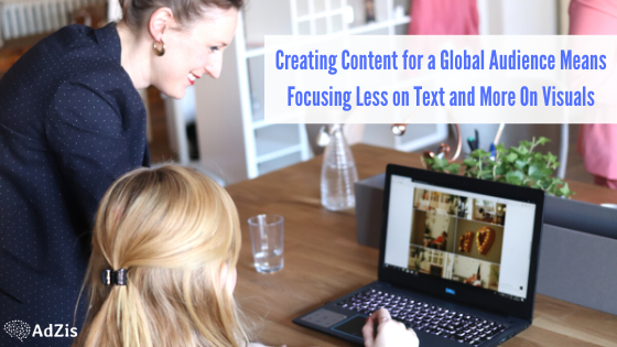
Thankfully, the solution is simple. Don’t necessarily change your messaging, but instead change your approach to focus less on the text and more on the visuals behind it all.

The Power of Visual Marketing: An Investment That Pays Off in More Ways Than One
When you load up an Infographic maker like Visme (which I founded), try to think about the message you want to tell visually first and foremost. Try to distill the essence of that narrative down to just a second or two – this will act as the rough framework for all the work you’re about to do.
But then, think about exactly how much text is actually needed to communicate that message in the most effective way possible. If you really put your mind to it, you’ll probably quickly find that the answer is “not nearly as much as you thought.”
This usually works particularly well with collateral that doesn’t require a lot of text to resonate in the first place. Anyone who has ever sat in front of a graph maker can tell you that the written word is not the most powerful tool in your toolbox. Shapes, colors and even the size of elements are far more important to showing, not telling, the relationship between two or more ideas.
You could also try to combine different types of visual collateral to tell a complete story in a number of different ways. Maybe you’ve created your Infographic and there are a few different points that need further explanation. Before you write up a few paragraphs of text, ask yourself if there’s some other type of visual element that can fill in those gaps just as well. Maybe you don’t have to write anything at all – maybe a small supplementary chart or graph will get the job done just as nicely.
If you don’t want to try to tackle all of this before work begins, you could even try to start with the visuals and fill in any “gaps” that remain in the text. Pretend you were creating materials without any words to speak of. Tell as much of the story as you can visually and then take a step back. Is it easy to follow? Are there parts that are unclear? What other problems are inherent in the version that stands? Fill those gaps and solve those problems with the careful application of the bare minimum of text.

In other words, visuals are no longer something designed purely to compliment the written word. We’ve officially entered into an era where the written word is meant to complement the visuals.
Keep in mind that we’re not saying that you should never include text in your marketing collateral. Far from it. It’s just that you should only use the bare minimum amount of text that you need to successfully tell your story and create the experience you set out to offer to people in the first place.
The Additional Implications of the Visual World
Of course, this is a decision that pays off in a variety of other ways, too. If you’ve got a visual-heavy piece with only a few hundred words of text written in English, translating that piece and adapting it for a new market becomes far easier. You’d still need to make sure the message applied to a different market and you would want to remove any cultural references that might not hit in the way they do in the United States, but you can put in a far smaller amount of effort to take the same collateral and bring it to a whole new set of eyes.
You can even take these benefits one step further by choosing subjects that work well in a visual realm, to begin with. When you use a resource like Respona to conduct keyword research and to try to get a sense of what topics people are talking about, try to choose ones that apply to more than one country and culture. This doesn’t mean your marketing materials should suddenly become broad in nature – it’s just that if a topic appeals to two different markets, there’s no reason why that shouldn’t become one of your top priorities.
Likewise, think about how quickly the right piece of content can go viral on a social media site like Facebook or Twitter. These social networks have a dedicated user base of literally billions of people. Going viral and getting the name of your business trending in the United States is one thing. Getting it trending worldwide is something else entirely.
That may not necessarily be something you’re actively interested in, and that’s okay. But the only way to even think about getting to that point is to first start creating content with a global audience in mind.
All of this is in addition to the natural benefits of visual communication. Not only is 90% of all data transmitted to the brain already visual, but the brain also processes visuals literally 60,000 times faster than text, too.
So not only are you creating content that works incredibly well on a mass scale, but your collateral will also start to resonate more and make a bigger impact with your local, English-speaking audience, too. That benefit alone is often more than worth the effort required to shift your point of view and start thinking in a more visual way.

The Brave New World
In the end, remember that none of this is to say that the written word isn’t important. Your number one job as a marketer is always to provide as much value to your customers as possible – sometimes, the only way to do that is with an 1500 word blog post.
Likewise, we’re not saying that you should only focus your efforts on a global audience. Specificity is very much alive and well on the Internet and sometimes, the best way to accomplish your goals involves going after a smaller, more niche, more local audience.
It’s just that in the era we’re currently living in, the world is only getting smaller. Your best friend could be located halfway around the world and might hold that status, despite the fact that the two of you have never met in real life. When you can use modern technology to create stronger, more intimate and more personal connections with anyone, there’s absolutely no reason why you shouldn’t capitalize on that opportunity.
For marketers who want to do exactly that, focusing less on the text and more on the visuals is absolutely the way to go.
About the Author
Payman Taei is the founder of Visme, an easy-to-use online tool to create engaging presentations, infographics, and other forms of visual content. He is also the founder of Hindsite Interactive, an award-winning Maryland digital agency specializing in website design, user experience, and web app development.
When potential customers browse online stores, the majority of them have their minds already made up and are keen on buying something, you just gotta shove them in the right direction. This is where a well-crafted product page comes into play. By infusing unique, creative and perfectly optimized e-commerce content, you can boost your market copy and increase your conversion rate. In that case, Adzis is the right choice for you to create captivating and engaging product content to blast off your sale. You can check our site for more details: https://adzis.com/


